Apple Watch Series 4 评测:迄今为止最大的升级
At a Glance
Expert’s Rating
Pros
- Lightning fast
- Much larger display
- New and improved health features
Cons
- The price jumped up a lot
Our Verdict
The Apple Watch takes its biggest leap forward yet, and finally feels like it delivers on the promise and potential we’ve seen over the last few years. We still want sleep tracking and custom watch faces, though.
Best Prices Today: Apple Watch Series 4 (GPS only)
Retailer
Price

$399
Price comparison from over 24,000 stores worldwide
Not to be outdone by Amazon’s Prime Day sale, Best Buy is offering substantial discounts on the Apple Watch Series 4: Save $50 on both the 40mm model and the 44mm model.
Sure, Apple Watch is a huge success, outselling all rivals, but there are still a lot of fence-sitters not sure if it’s really a worthwhile addition to their Apple ecosystem. And not everyone is a watch person.
If this sounds like you, it’s time to get off the fence. The improvements in Series 4—a bigger display, faster processor, and better sensors—make Apple Watch downright delightful to use, elevating it from “neat gadget for Apple fans” to “gotta-have-it addition to your iPhone.”
The $399 starting price is disappointingly high, but this is the Apple Watch that finally feels like it delivers on the promise Apple has been building toward for the last four years.
The new display: 30% bigger is 100% better
The most immediately noticeable difference in the Apple Watch Series 4 is the new display. It pushes out toward the edges, shrinking bezels and rounding off corners to match the curve of the case. Whether you choose the big or the small watch, you get more than 30 percent more display area than the prior Apple Watches.
The Series 4 is slightly larger than Series 0-3, but rounder corners makes them feel the same size. Plus, it’s thinner, and all your old bands still work.
But that 30-plus percent makes a huge difference in usability. For one, it means that the small size Apple Watch has a display just a tiny bit larger than the old large Watch. Those with small wrists, like me, will appreciate the ability to choose the smaller size without sacrificing legibility. Whether you pick the small or large model, everything appears larger and more zoomed-in. Maps display more detail. If you get a link to a web page in Messages, you can actually read it on the watch. You may not want to, but it’s not the exercise in futility it is on Series 0-3 Watches. Every tap target feels larger and easier to hit. Every facet of the interface is easier to read.
This seems obvious, of course. Bigger is bigger. But it’s hard to appreciate just how much it improves usability until you try it out yourself. I have thin wrists and replaced my old large 42mm watch with the new small 40mm Series 4. It looks and feels better on my wrist, I didn’t give up an ounce of screen area, and still every part of the interface feels easier to manipulate.
If you size down from the old 42mm to the new 40mm, you get a more comfortable watch without losing screen size.
The higher resolution and larger size also enables new watch faces. There are handful of nifty animated faces added to all Apple Watch models in watchOS 5 (fire and water, liquid metal, vapor, and breathe), but two additional faces are exclusive to Series 4. Infograph takes an analog watch face and just crams it full of complications. There are so many that I honestly ran out of useful things to put there—I guess I should add a one-tap Shazam button to my watch face? Opinions are sharply divided about it. Some find it far too busy and full of mixed colors, others love the information density. I wasn’t sure about it at first, but it’s my go-to watch face now.
The new Infograph watch face is busy and colorful, maybe too much so, but I can’t stop using it.
Infograph Modular takes the existing Modular watch face (one of the most popular) and replaces the large center complication with a new high-info layout. Not many apps support it yet, but those that do can put a lot more detail in there.
The new display enhances the overall look of the Apple Watch, too. Rather than mixing a display that has sharp corners with a curved-corner watch face, the corners of the display now exactly match the curve of the case. This evens out the bezel all the way around, which is far more elegant. It’s the iPhone X look on your wrist.
Better sensors for a better you
Series 4 marks the first model where Apple has seriously upgraded the array of sensors that make so many of the Watch’s features work. The accelerometer and gyroscope are more sensitive, with more dynamic range—it can detect forces up to 32g, double the 16g of earlier watches, and motion data is sampled up to 8 times faster.
That hardware is used for all kinds of stuff in Apple Watch, from sit/stand detection to counting steps or swim strokes, and in my first week with the watch all of these activities seemed to be tracked just a little bit better. Any activity that relies on measuring motion was maybe a little bit more steady and predictable, with less moment-to-moment variance.
Most of the improvements to activity tracking come in watchOS 5, but the Series 4 hardware makes it more reliable and battery-efficient.
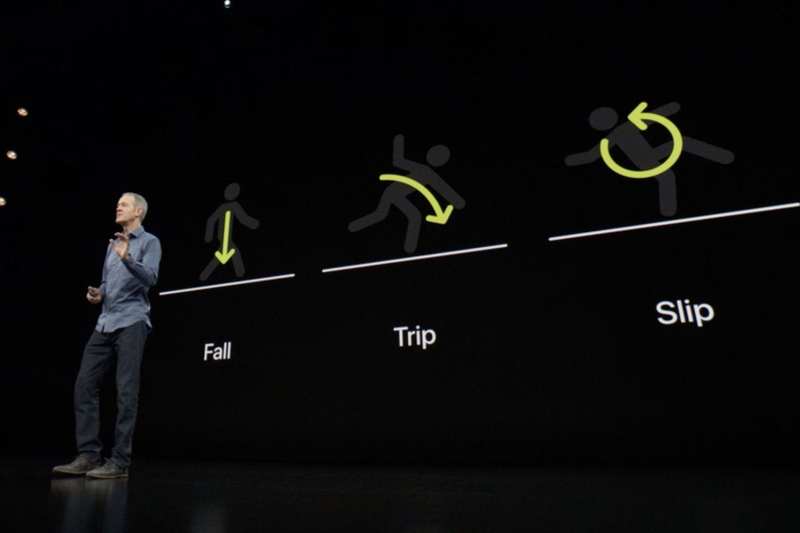
More importantly, the new motion/gyro sensors add the new ability for the Series 4 to detect accidental falls. If you take a bad tumble and don’t move right away, a warning will pop up. You can quickly call emergency services if you need help, say you’re okay, or tell your Watch that you didn’t fall after all. If you don’t do anything for about a minute, the Watch will begin a 15-second countdown while tapping you on the wrist. When time is up, it will automatically contact emergency services and text your emergency contacts with your location.
It’s a cool feature that seems obviously aimed at seniors; in fact, it is only enabled by default for those aged 65 or older. Everyone else has to go into the settings to enable it. I spent five minutes tossing myself on the ground in various ways and couldn’t get it to trigger. It’s hard to fake a fall that looks, to these sensitive sensors, like a real tumble, but I don’t think false positives are going to be a big problem here.
I wasn’t able to trigger the fall detection with a fake tumble. It’s hard to fake a fall that feels like a real one.
Still, accidental fall detection going to be a hit feature among its intended audience. Some senior is going to take a spill and their Apple Watch is going to notify their children, saving them a lot of painful time spent on the floor. Then they’re going to tell all their friends about it down at the water aerobics class. The next week, half of the class is going to have an Apple Watch on their wrists.
There’s a new optical heart rate sensor that is more sensitive and energy efficient, too. WatchOS 5 adds the ability to detect abnormally low heart rate to the existing high heart rate warning, and with a software update later this year, will warn of irregular heart rate as well.
Exclusive to Series 4, however, is a new electrical heart sensor than can perform a single-channel electrocardiogram (ECG). Just run the app, hold your finger on the digital crown for about 30 seconds, and you get an ECG chart you can share with your doctor as a PDF, along with an analysis of whether your heart activity is normal or not.
The ECG feature will be U.S.-only at first, and will be added in a software update this fall.
Apple made a lot of noise about how this feature has FDA clearance, but that is different than FDA approval for medical devices. The FDA granted it clearance in the Class II category, which it describes thusly:
Electrocardiograph software for over-the-counter use. An electrocardiograph software device for over-the-counter use creates, analyzes, and displays electrocardiograph data, and can provide information for identifying cardiac arrhythmias. This device is not intended to provide a diagnosis.
It’s not meant to substitute for a real medical ECG, it’s not approved for people under 22 years of age, and it won’t necessarily find heart problems. But for some, it will point out a potential problem that leads them to a doctor for a real test. In some cases, that will amount nothing. In others, it will lead to a diagnosis that will save someone’s life.
Unfortunately, it’s not yet testable. The ECG feature is rolling out later this year in a software update, and only to U.S. users. Apple will have to obtain the proper medical device clearance before it can be enabled in other countries. The company has given no timetable for this except to say they’re working on it.
The S4 SIP: Finally fast and fluid
For all the quips about the Apple Watch being a mini iPhone on your wrist, it has never felt like using one. Even simple apps would take a while to launch. Sometimes it was hard to get a swipe or a tap to register. Scrolling would sometimes be smooth, sometimes stutter terribly. Most users didn’t consider these to be dealbreakers because compromised performance is common to most smartwatches, and because you just naturally interact with a watch in shorter, simpler ways. We just don’t hold them to the same standards.
As good as Apple Watch performance has been compared to other smartwatches, these little fits and starts have affected the way we perceived the Apple Watch: It was a device for checking on important notifications, getting some “at a glance” info on your watch face, and triggering “set and forget” activities like music playlists or exercise tracking. It’s meant to give you quick or track an activity with minimal actual interaction, right?
Then along came the Series 3, bringing a serious speed boost over the Series 2. With responsiveness and app loading improved so much, it started to feel like the Apple Watch was something you were meant to interact with, not just passively push information at you. The Series 4 feels like a similar leap over the Series 3.
The new S4 silicon-in-package is so much faster that it’ll change the way you use your Apple Watch.
Apple says the new dual-core 64-bit processor in the S4 Silicon-in-Package (SIP) is up to twice as fast as the S3, and it’s easy to believe. Everything is just buttery smooth and responsive. Taps and swipes register instantly. Tap a complication and the associated app just springs right open. Even notoriously slow-launching apps like Pokémon Go pop open so quickly you’ll think something must have gone wrong.
It has completely changed the way I use my Apple Watch. Apps I wouldn’t have bothered with before are suddenly part of my regular daily use. Even on a Series 3, some apps take a few seconds to load, and I won’t bother with them. That sounds like an impossibly high standard, but if I can’t launch a Watch app faster than I can pull my iPhone out of my pocket, I’ll just use the phone to get a full-featured app experience. Series 4 makes everything so instantaneous and responsive that I find myself willing to use apps I never would have considered before.
In many ways, it feels as though watchOS was too forward-looking, and has been waiting around for hardware fast enough to run it the way it was meant to be experienced. With the Series 4, that hardware seems to finally be here.
Battery life: All day and then some
The Apple Watch has always been a “charge it every day” device. So when I say that the battery life on the Series 4 is excellent, it’s in the context of other devices that claim full-day battery life. Apple says the battery should last you up to 18 hours, but in practice, I got a lot more.
I took my 40mm Series 4 (Wi-Fi + GPS) off the charger at 9 a.m. on Saturday and wore it until it died, even keeping it on as I slept, though I didn’t run a sleep-tracking app. It finally shut off around 5pm on Sunday, 32 hours later.
The second-generation optical heart rate sensor is clustered in the center of the ceramic back, with electrodes for the ECG surrounding it.
Over that time I tracked a couple hour-long workouts at the gym while listening to music (streaming from my iPhone, using the Watch to skip tracks and adjust volume). I checked dozens of notifications. I made several phone calls. I asked Siri a few questions, and checked the weather a lot. I set some timers while cooking dinner. If anything, I used it more than I typically do because I was trying out new apps. Later in the week, I repeated the test with the same results.
Yes, tracking outdoor fitness activity and streaming music from your Watch to your AirPods will run down the battery faster, as will cellular data access on cellular-equipped models. But my 32-hour stretch is way beyond Apple’s 18-hour promise. And I’ve been using the smaller size—the larger Watches usually typically last a little longer.
I don’t know what sorcery Apple’s doing here, but I like it. The Series 4 is way faster than the Series 3, but it’s thinner and has a smaller battery, and yet it still lasts just as long, perhaps even longer. Bravo!
That’s not to say that multi-day battery life isn’t high on my wishlist for the future of Apple Watch. I still long for an Apple Watch with the battery life of the Fitbit Ionic.
Minor changes and missing features
There are a few minor changes to the Series 4 worth mentioning. The most noticeable difference, at a glance, is the slightly updated shape of the case. Each of the two sizes have grown 2mm taller, so the small model has bumped up from 38mm to 40mm and the large from 42mm to 44mm. You won’t notice a significant difference on your wrist, in part because the corners are now more rounded and the watch is slightly thinner, shaving off the extra thickness added to the Series 2 and Series 3 and getting back to the trim profile of the Series 0. Existing watch bands still work, too: the 38mm bands fit on the new 40mm and the 42mm bands fit on the new 44mm.
If you’re into gold, you’ll be glad to see a new gold-colored stainless steel model. (The Series 3 only offered the gold color on aluminum watches.) And the cellular models are no longer adorned with a big red dot on the digital crown—there’s a subtle red ring, instead. You can thank the electrical pad required for the ECG for that.
The digital crown now has haptic response, too. There’s a gentle, subtle “tick” feeling as you scroll with it, giving it the feeling of little detents. It always puts a little smile on my face; just the sort of tiny detail I didn’t know I wanted until I had it.
For that matter, all of the haptics feel better, signaling possible improvements to the Taptic Engine. For example, I’ve always known the haptic signal for unlocking my Mac with my Apple Watch as a little double-wrist-tap. Tik-Tik. With the Series 4, it the two taps feel distinctly different and mimic the feel of a lock unlocking. Ca-click.
With the mic moved to the right side of the Watch, and a much louder speaker, making brief calls on your Apple Watch could become a habit.
The speaker is a lot louder than on earlier Apple Watch models, and the microphone has moved to the other side of the casing. This, along with better noise cancelling, have made making phone calls from your wrist a real possibility. I made three phone calls of various lengths and the people on the other end couldn’t tell I was talking on my Apple Watch at all until I told them. The speaker is now loud enough that you can hear it without holding your wrist up to your ear.
While making phone calls is not a new feature, the Series 4 takes it from a gimmick I’ll never really use to a legitimately useful feature. If I have a very short phone call to make, I’d have no issue making it from my wrist.
For all that the Series 4 and watchOS 5 add to Apple Watch, there are still a few features offered by competing products that we still don’t have. I think you get good enough enough battery life to allow for built-in sleep tracking, for example. Apps like AutoSleep do a good job, but I want an integrated solution, preferably one that puts the watch into a special super-low-power sleep tracking state.
I’d also love to see an option to burn a little of that extra battery life with always-on watch faces. It’s a shame that this attractive hardware just turns into a blank, black slate when you’re not using it. WatchOS 6 should give every watch face an optional always-on mode that eliminates complications, colors, and excess animations in favor of simple designs that look good but don’t cause the OLED display to use much power.
Just about everyone wants third-party watch faces, too. Apple obviously doesn’t want to open the floodgates to a bunch of ugly or trademark-infringing stuff, but surely some thoughtfully-constrained tools could let developers use a set of templates and features along with limited custom artwork and animations to make new watch faces that satisfy Apple’s standards?
The Apple Watch we’ve been waiting for
If you’ve been waiting for a big improvement to the Apple Watch to add one to your wrist, now is the time. No single new feature is groundbreaking by itself, but the combined experience feels like a night-and-day improvement over previous Apple Watches. If you have a Series 2 or earlier, you’re going to feel like you’re upgrading from an iPhone 6 to an iPhone XS. If you have a Series 3, it’s going to be harder to justify a $399+ purchase less than a year later. With all the new features in watchOS 5 and the solid performance of the Series 3 hardware, you can probably wait another year.
Going back to any prior Apple Watch after using the Series 4 feels like tying my shoelaces together. Why does everything take a second or two to respond? Why is the screen so cramped? What happened to the little tick feeling when I scroll the crown? Is that app still loading or did it freeze?
It seems a little trite to say that the Series 4 is just the same Apple Watch with a bigger display, better sensors, and a faster processor, but that’s exactly what it is, and it’s fantastic. Every other Apple Watch felt full of promise, but Series 4 feels like promise fulfilled.
Best Prices Today: Apple Watch Series 4 (GPS only)
Retailer
Price

$399
Price comparison from over 24,000 stores worldwide


