macOS 与 Windows 10

At a Glance
Our Verdict
Chances are you’re reading this to find out what Windows has that macOS doesn’t, or what features macOS has that Windows doesn’t. The fact is that over the years the two operating systems have become more and more similar in terms of features.If you’re a Windows user moving to the Mac, then we think you won’t miss anything, and the same goes for the move from macOS to Windows. But learning a new operating system is the frustrating factor in any switch. The benefits have to outweigh the disadvantage of the unfamiliar.For anyone who already uses an iPhone or iPad we feel that macOS will be familiar even if you use Windows, which we’d say is a good reason to move over to Mac.
Windows 10 is now the most popular desktop OS in the world, with over 800m users. Its biggest rival, macOS, lags far behind in terms of market share, and while Apple is usually coy about releasing specific figures, we do know that back in 2017 it stated that the operating system had around 100m users.
But being popular doesn’t necessarily mean you’re the best, so we take a look at what macOS has to offer that our Windows friends can only dream about, and the Windows features that make us jealous.
macOS – previously known as Mac OS X – has been on Macs since 2001. Apple frequently issues minor updates, but more significant changes come once a year, usually in the autumn. We have a story that runs through the different versions of Mac OS X here. The operating system has evolved over time to have more and more in common with iOS. The current version is Mojave, which is macOS 10.14, and is due to be replaced in autumn 2019 with Catalina (10.15).
Windows 10 on the other hand first arrived in July 2015. Since then Microsoft has released various free updates to the operating system which usually arrive in the spring and autumn. At the time of writing the last update to Windows was May 2019 and the next update is due in September 2019.
In this comparison we’ll look at some of the features in both operating systems that are the most useful, those that are unique, and what is the same.
(Here’s how Mojave and Catalina compare.)
Design
Let’s face it, Apple is famed for the design of its hardware, so the expectation is that the software design will be similarly beautiful. Microsoft, on the other hand, tends to be thought of as, dare we say, a bit boring and functional. Does the design of Windows 10 reflect this? We’ll take a look below.
macOS design
The last time the design of macOS (or rather Mac OS X) changed significantly was in Yosemite, when it had an overhaul, at the hands of Apple’s design guru Jonathan Ive, to bring it into line with iOS.
Design-wise, the macOS has changed little since then. The upcoming Catalina is very similar to Mojave, which itself is pretty much identical to High Sierra which was identical to Sierra, and Sierra was virtually identical to its predecessor El Capitan, and that to Yosemite.
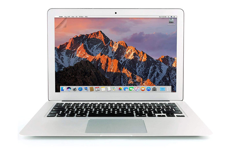
In terms of the look and feel, macOS is designed for high-res Retina displays. The majority of Macs these days feature displays with high resolutions and the interface takes advantage of that with little touches that wouldn’t look as good on a lower-resolution display, such as elegant, thin typefaces and transparency effects.
Some interface elements are semi-opaque, allowing a blurred-out version of whatever is behind the window to show through.
Other features include a Dark Mode that was introduced in Mojave (shown above). Previously macOS only allowed you to darken the menu bar at the top of the screen as well as the drop down menus that appear from that, and the Dock. But as of Mojave you can overhaul the whole interface to use a darker, more muted colour scheme systemwide. Dark Mode makes the Mac interface a little more comfortable to use at night or in a dark editing studio, for example.
There are also various design touches that make the most of a small display. For example, you can hide the Dock, or move it to the side, or hide the menus at the top of the screen. In Yosemite Apple moved the traffic light buttons for close, minimise and full screen mode onto the same level so that the height of the window title bar could be cut. So, for example, in Safari the three buttons are on the same level as the next/previous button and the address/search bar.
Several interface elements were flattened back in Yosemite. For example, previously the Dock had a 3D look, but now it’s flat with transparency, and as a result looks simpler and more modern.
Windows design
In terms of design Windows 10 initially lacked the clean modern look of macOS, but since it was launched in 2015 it’s had a design refresh – known as the Fluent Design System – bringing more animations, translucency and blurring elements (known as Acrylic) that are supposed to make it feel like the design elements of Windows seem like they are behaving like objects in the real-world would.
The changes have brought new 3D elements, as well as more light, depth, motion, and the UI elements scale to remain usable across different devices. Changes are being rolled out gradually, with changes coming with each twice-yearly update to the OS.
With one such change was minimise, maximise and close buttons are now incorporated into the window itself, perhaps in an effort to reduce the space taken up by these interface elements, as in the case of MacOS.
A dark mode – or rather dark theme – arrived with the Windows 10 Anniversary Update back in 2016. When you switch it on Universal Windows Platform (UWP) apps will change from light to dark mode. To change to dark mode you need to go to Settings > Personalisation > Colours > App Mode > Dark. Supported apps include, Windows 10’s File Explorer, Microsoft Office, Edge browser and others.
The May 2019 update added to this with a new Light theme that brings a bit of sunshine to areas like the Start menu, taskbar, and notifications. It means that users can now easily change their themes to suit their moods.

User Interface
Of course design isn’t only about how the operating system looks, it’s also the way you interface with the product. So we’ll look at the differences between the user interfaces of MacOS and Windows 10 next.
In some ways the interface you prefer is probably the one you are most familiar with. If you have been using a Mac for years you may feel lost on a PC, and vice versa.
macOS UI
Back when Steve Jobs and Steve Wozniak invented the Macintosh they had a philosophy that the interface should be really intuitive. As a result the Mac interface has always been really simple to use, as well as being elegantly designed – like the Mac that runs it.
You interface with your Mac mostly via the Dock, which can house shortcuts to your favourite apps and frequently accessed folders; the menu bar at the top of the screen; the Finder file browser; and Spotlight search.
There are other interface elements that you can use, such as Mission Control, for viewing everything you have open at a glance, and LaunchPad, which shows you all your apps. Say you want to open an app, you can either click on the icon in the Dock, search for it using Spotlight, open it via LaunchPad, or ask Siri, Apple’s voice activated assistant to launch it.
Looking for a document you have been working on? Again, you can search using Spotlight, use the Finder file browser, find it in a Smart Folder, or Open Recent. Wondering if it’s the file you were looking for. You don’t need to open it, you can get a Quick Look by clicking on it and pressing the Space bar.
One of our favourite features that arrived in Sierra was the ability to share your Desktop and Documents folders across multiple Macs. So if you were working on something and saved it on your Desktop on one Mac it would be accessible from the Desktop on another Mac you were signed in on. This is really useful if you work on more than one Mac – say one in the office and one at home. Catalina adds even more compatibility by introducing shared folders to the Notes app.
A new feature that arrived with Mojave is Desktop Stacks. With Desktop Stacks turned on things are grouped on your desktop according to type (or date if you prefer). So if you take a screenshot it will automatically appear in a Stack that contains other screenshots. If you tend to put everything on your Desktop this can significantly reduce the clutter while keeping the things you need to get to accessible.
If you save everything to the desktop this in-built sorting and syncing is helpful, but you can also allow the app you are using to save it into a folder associated with that app. So if you open the Pages app (Apple’s word processor) on any of your Apple devices you can easily access a document you have created in that app.

If you’re really particular about your filing this might sound like it’s not organised enough, but it is so easy to find things that you really don’t need complicated filing systems to make it work. That said, if you really like to keep things in order you could assign a particular Tag when you save something to make filing and finding things really easy. You can then create Smart Folders which include everything assigned with that Tag – and since files can have more than one Tag it can appear in more than one folder without being duplicated.
Other differences in the way you interact with the Mac compared to the PC include the keyboard – with the Command key on the Mac essentially replicating the Control key on the PC. People will say that Macs have one button mice, but that’s not strictly true – you can right click on a Mac mouse or trackpad. But there are further differences to that method of interaction.
For example, the TrackPad on a Mac laptop allows you to use various gestures to interact with the Mac. Sweeping fingers across, or using pinch to zoom, in a way reminiscent of the way you use an iPhone. In fact a few generations ago Apple switched the way that a mouse scrolls on its head, just to bring the Mac in to line with the iPhone interface. So now you push up with your mouse to move down the page. Once you get use to this it’s logical, but it can really confuse you at first. Windows 10 has various trackpad gesture controls, but they pale in comparison to those on macOS.
One cool new addition that is set to appear with Catalina is Screen Time, which is already a feature on iOS. This monitors the time you spend on your Mac, producing reports that give you a deeper insight to your behaviour. It also gives you the ability to set limits on certain apps or sites if you think you’re wasting too much time on them. Utilising Family Sharing also turns this into a handy parental control tool for your children’s macOS or iOS devices.

Windows UI
Disclaimer: We don’t use Windows everyday and therefore aren’t as familiar with the interface as we are with MacOS. We will do our best to compare the way the Windows interface works with the way that the macOS interface works here with a little help from our colleagues on Tech Advisor.
Where you have the Finder on MacOS you have File Explorer on Windows 10. This allows you to browse and open all the files you have stored on your PC. Quick Access is a useful feature that automatically populates with your frequently accessed folders and recent files, you can also automatically pin things to it to make it easy to find things. To get a similar effect in the Finder on the Mac you could add a file to the Favourites bar, but it isn’t self populating in the same way as on Windows.
As with the Finder on the Mac there is a Preview feature that lets you see an image or view a video without having to open it. The implementation of this isn’t as neat as on the Mac though. It’s a particular view that you have to choose in the File Explorer: Preview Pane.
The Taskbar in Windows is the strip at the bottom of the screen that includes shortcuts to your favourite apps, the Start Menu, and Search. It’s a little bit like the Dock on a Mac, and a little bit like the Mac menu bar. It takes up a lot less space than both, but we like having everything a click away. It strikes us that everything is pretty much buried in this set up, but regular Windows users can use shortcuts to find and open apps or documents with ease.
Windows 10 also uses Tiles. These are a little like shortcuts to elements of different apps. Similar to Dashboard Widgets in the Mac OS or Glances on the Apple Watch.
There is a Full Screen mode in Windows 10, just as there is in macOS, but Windows also adds the option to “Snap” up to four apps per screen, with each occupying a quarter. When you’ve snapped an app you can also see a tab view of some of the remaining open apps so you can fill your entire screen.
macOS has a similar feature in Split View, which arrived with El Capitan, but this limits you to two apps side-by-side, rather than the four in Windows 10.

Windows 10 users can press Alt-Tab or Windows-Tab to see a thumbnail view of the apps that are running, or they can select the full-screen Task View from the taskbar which brings up an overview of the open apps, at which point they can use the mouse to select the app they want. Along with this Windows 10 users can use Task View to add desktops so that they can separate certain apps into, well, Spaces, like on the Mac. These features of Task View sound very similar to Spaces and Expose, which have been on the Mac for years – Spaces was introduced in 2009 for example, and means that apps can be assigned to different desktops.
A feature that arrived on Windows 10 in the 2017 autumn update was My People – where you can pin up to three contacts to your taskbar so you can stay in constant touch with them. If you click on them you’ll see two ways of contacting them – Skype and Mail. It reminds us a bit of the Friends feature on the Apple Watch which appeared in the first generation and is now long gone because nobody used it.
Action Centre is Microsoft’s answer to Notifications Centre. You can choose which apps can send notifications, and you can reply to things like text messages here just as on macOS. Both Mac and Windows have a Do Not Disturb mode – known as Focus Assist on a PC. With this feature turned on you can stop all the visual and audio notifications that might distract you.
Microsoft’s Clipboard works across the cloud so that when you copy something it will be available on any of your Windows devices. It’s the same on macOS since that feature – Universal Clipboard – was introduced in Sierra back in 2016. Windows also has a neat feature – introduced in October 2018 – where it can store multiple clippings in the clipboard, which you can view if you press Win + Shift + S. We want this Apple!
Snip & Sketch is a new tool for taking screenshots in Windows 10 (it arrived with the October 2018 update). Apple also made changes to screenshooting when it introduced Mojave in October 2018. With Mojave you can screenshot and then edit it, crop, rotate, or notate without opening any other app. Snip & Sketch seems similar in as much as you ‘snip’ a screenshot, and then ‘sketch’ on it, which encompasses basic editing features.
One feature that Snip & Sketch offers that macOS doesn’t (yet) is the ability to draw a freehand shape around the area of the screen you wish to take a grab of – handy. To open up Snip & Sketch press Windows + Shift + S. Most Windows users probably use the PrtScn key on their keyboard to take screenshots, strangely the PrtScn key doesn’t bring up the Snip & Sketch tool though.
Another feature that you’ll find in both macOS and Windows 10 is the ability of the operating system to help you reclaim storage space. On a Mac you can manage your Storage via About the Mac > Storage > Manage and choose to save space by storing files, photos and messages in iCloud, and review duplicated files or particularly large files, so that you can reduce clutter. Similarly, Windows 10 has Storage Sense, which can delete junk and temporary files, and archive old files in the cloud.
One change that arrived with the 2017 Fall Creators Update could be seen as Microsoft’s answer to the way a Mac user’s files are stored in iCloud and can be accessed and edited on all of our devices. Where Apple has iCloud, Microsoft has OneDrive, but the implementation isn’t quite as smooth. For example, prior to the autumn 2017 update, a synced copy of every file stored on One Drive would also exist on your computer – which could take up a lot of space. With Files on Demand, you can see a shortcut to your OneDrive-stored files alongside the files on your computer – those files no longer need to be stored on your PC. You still have to download a file before you can edit it though.
Nearby Sharing will sound familiar if you use AirDrop on a Mac or iOS device. AirDrop makes it possible to share files using a connection enabled by WiFi and Bluetooth and has been on the Mac since Mac OS X Lion in 2011 (although it only really been possible to share things between Macs and iOS devices since the arrival of Mac OS X Yosemite in 2014). Nearby Sharing works in a similar way and arrived on Windows until May 2018. We’re not sure what took Microsoft so long to be honest.
Where the Mac has the Finder, Windows has File Explorer. One File Explorer feature in Windows 10 is a Quick Access area where you can see all the folders you browse most often, the files you have recently accessed, and folders you have ‘pinned’ there for ease of access. In the May 2019 update the search capabilities in Windows 10 increased so that now when you enter a term it will look across the entirety of your files rather than just the main sections.
Another way to access files and other collateral, is via Timeline, a new feature that arrived in the Spring 2018 Windows 10 update. Windows’ Timeline groups all the documents and webpages you’ve viewed or worked on over the past weeks or months so you can easily go back to what you were working on at any given time, kind of recreating that working environment. It might be useful if you tend to work on multiple projects, although it strikes us that could equally be found to jumble everything up. You access this timeline by clicking on the Task View icon in the taskbar.
Where macOS has System Preferences (or Settings on iOS devices) Windows has always had Control Panel, where you’d find various ways to tweak the settings of your PC. It’s a bit too complicated for the average user though, and probably best left alone. Mac users who want to make complex changes to the system can do so through Terminal, but again, it’s not for the average user. Probably because of this, Microsoft introduced Settings in Windows 10 as a simpler way to address changes to settings – it’s much easier to use (PC Settings did exist in Windows 8 but wasn’t as extensive).
Integration across mobile and desktop
Our laptops and desktops aren’t the only devices that we create things on these days so it’s essential that all our devices work well together.
Here we’ll assess just how happily our Macs and other Apple devices play together with their differing operating systems compared to the Windows devices that all share the same OS.
macOS and iOS
There might be two operating systems: iOS and macOS, but that doesn’t mean that they are foreign territories. One of the things we love about macOS and iOS is the way that the two operating systems link all our Apple devices together. This is described as Continuity by Apple and it’s a feature that’s been around for a few years.
Essentially it means that all your devices are linked. This means that you can access anything on any device. This could be an email that you started drafting on your iPhone on the way to work but want to finish on your Mac – once you arrive in the office you can simply open Mail on your Mac and finish the email you were composing due to Hand Off, a technology that ‘shares’ the incomplete email to your Mac without you having to do anything.
Similarly if you have a webpage open on your iPhone when you switch to your Mac you can automatically open the same page there.
There’s also the fact that you can send and receive text messages on your Mac – a feature that became even better in High Sierra since messages are now stored in the Cloud (which means that everything will be in sync across all your devices). You can also make and receive phone calls because your iPhone can route them through to your Mac.

A new feature that arrived in Mojave in 2018 was the ability to use your iPhone to directly input a photo into a document on your Mac. This will be joined in Catalina with the new SideCar feature that turns compatible iPads in to second screens. It’s not just for viewing though, as you’ll be able to edit designs and markup documents using an Apple Pencil on your iPad.
One thing seems sure though, you will never be able to run iOS on a Mac or macOS on an iPad. Apple’s always been against the idea of unifying the two operating systems – a while ago Apple’s CEO Tim Cook suggested that it is better not to try and create a “toaster-refrigerator”. He told analysts in 2012: “You can converge a toaster and a refrigerator, but you know those things are not going to be probably be pleasing to the user.” He was having a dig at Microsoft and Windows 8, which was designed to work on desktops, laptops and tablets, but his point was that some functions are better suited to a PC, and others to a tablet.
However, times change. Apple’s not about to converge iOS and macOS, but later in 2019 we will learn more about Apple’s plans to make it easier for developers to port apps over from iOS to the Mac and vice versa. We will see how Apple can make something that is designed for a touch interface be intuitive to use with a keyboard and mouse.
When it comes to some professional uses the iPad is a little held back by the fact that it doesn’t run macOS. Hopefully the changes coming in the autumn will enable developers to more easily port apps between the two types of Apple device.

Windows and Android
While Windows 10 had originally been intended to work with Window Mobile smartphones, the latter never really caught on, resulting in them now being consigned to the great tech dustbin of history. Instead, Microsoft has switched to focussing on Android as the main partner for its PCS. In the 2017 Fall Creators Update the Settings menu gained a Phone section where you can connect your PC to your phone so you can take advantage of “pick up where you left off” functionality a little like what arrived on the Mac with Continuity in Yosemite back in 2015.
Similarly, if you install the mobile Edge browser and/or Microsoft Launcher apps and link your phone to your Windows account, you will be able to push webpages and even files to your Windows 10 PC via a “Continue on PC” option.
Android users can now use the Your Phone app to enable their PCs to respond to text messages and see missed calls, as well as the promised screen mirroring feature that’s due to arrive soon. Plus, Cortana will show documents and websites you were accessing on your other devices, so that you can pick up where you left off. The list of supported software is limited though.
Apps & software
Critics praised the improvements to Windows 10’s bundled software over Windows 8. However, it’s our opinion that the apps that come with Windows aren’t a patch on those that come with the macOS.
There are lots of apps that ship as part of macOS but rather than cover all of them we will compare the photo editing and web browsing offerings for each OS in detail, and then look at a few of the other apps.
Photo editing: Photos vs Photos
Photos is the editing and photo library app for Macs and iOS devices. It gained new, more advanced, editing tools in High Sierra, including professionally inspired filters, Colour Curves and the ability to turn a Live Photo taken with your iPhone into a Gif. Thanks to Photos in the Cloud you can access all your photos on all your devices – and if you make an edit on one device that edit will be registered on all your devices. (To use this service you will need to pay for extra storage in the Cloud, but iCloud storage isn’t expensive – find out how much iCloud Storage costs here).
Catalina brings an updated look to the layout that removes duplicates and allows searching via days, months and years while also reminding you of what happened on birthdays, anniversaries and holidays.

Like Photos on the Mac the Windows Photos app lets you store, share and edit photos. This includes cropping, adding filters, as well as putting together videos from moving or still images, replete with titles and effects. There’s also the recent Photos Companion app that allows iOS and Android users to quickly transfer images onto their PC .
A new addition to Photos in the 2017 Fall Creators Update was Story Remix – which we think looks a bit like Memories. Microsoft describes it as an “evolution of the Photos app” that uses machine learning and mixed reality to algorithmically generated a movie montage using your pictures and videos (just like Memories). Windows also adds the ability to pull in 3D objects and animations to these Stories. We don’t think we miss the ability to do this last bit.
Paint also got an update in 2017’s Fall Creators Update. Magic Select can edit out parts of a photo. It intelligently traces their outline, cuts them out, and fills in the background based on the rest of the image. The results are slightly less hilarious, and a lot less professional looking, than those cases of people asking Photoshop gurus to cut their ex boyfriend out of a photo.
 (Photo from our colleagues at PCWorld)
It strikes us that the Photos app on Windows isn’t as feature rich as Apple’s Photos app – it seems that’s what Paint is for – and whether that matters to you depends on how much of a budding photographer you are.
Web browser: Safari vs Edge
There are so many alternatives to both the Mac and Windows web browser that the choice of operating system. If you want to move beyond Apple’s offering then read our Best Mac Browsers for the best alternatives.
If you were to stick to the browsers that ship with the operating systems though you’d be looking at Safari or Microsoft Edge (which replaced Internet Explorer). How do they compare?
As we mentioned at the beginning one of the new features in Safari in High Sierra was the ability to stop videos auto playing and stop ads from following you around the web (like when you look for a holiday and then all the ads everywhere you go are trying to sell you a holiday).
Mojave brought the welcome return of favicons (the little icons in tabs that let you know which website you’re on), and Catalina promises a speed bump as well as a new layout for the home page that features favourite sites, plus Siri suggestions from your bookmarks, reading list, and any links received in iMessages.
Old, but still good, features in Safari include a Reader view that allows you to strip out ads from the page (Apple hates ads), the ability for sites to send you notifications within the browser, a Reading List that lets you save webpages to look at later (and even browse offline), and lots of ways to make it quick and easy to visit your favourite sites – you can Pin them to the top of your browser, save them as a Favourite, or as a Bookmark.

If you’ve not been using Windows you might not even realise that Internet Explorer is no longer the default browser. Microsoft literally went back to the drawing board with its web browser, before it launched Windows 10 – that’s how bloated had IE become. Now Windows users have a new browser called Edge, which took over from IE when Microsoft introduced Windows 10.
As with Safari there is a combined URL and search bar. Speaking of search, unsurprisingly Microsoft makes the default search engine its own Bing. Unfortunately Microsoft doesn’t make it very easy to switch away from Bing, and based on the fact that Bing isn’t exactly a popular search engine it must be the case that many users are choosing to use a different browser.
There are some good features in Edge though. For example, it offers a reading view which is similar to Apple’s Reader view which strips all the ads and distractive elements from a page.
As in macOS there is also a Reading List feature that allows you to save things to read. However, unlike the Mac Reading List feature you can’t refer to these pages when you are offline.
In the autumn 2017 update Edge gained the ability to enter a full-screen mode. If you are a Mac user you are probably astounded that this wasn’t this supported before. A useful feature in Edge is the ability to save a group of tabs that you can open at a later date.
Edge can also be used as a PDF reader, with fillable fields, markup, and even the ability to ink a digital signature right within the app – which means nobody needs to download Adobe Reader. (On a Mac, Preview is a handy PDF reader and editor). Both Edge and Safari can take on dark mode.
Microsoft has announced that it will be completely overhauling Edge, rebuilding it on the Chromium engine that powers Google’s Chrome. This should bring instant support for the wealth of plug-ins and add-ons that make Chrome such a powerful browser. Beta versions are already available, so you can expect the replacement app to arrive in the near future.
Edge also integrates with Cortana, Microsoft’s Siri-like virtual personal assistant. We’ll look at that next.
Voice assistants: Siri vs Cortana
Apple’s voice-control tech, previously available on iPhone, iPad, Apple Watch and Apple TV, arrived on the Mac with Sierra in 2016. It had been rumoured to be coming to the Mac for years. We’ve always felt that Siri was a bit of an odd addition to the Mac, we can’t imaging that many people talking to their Mac in a crowded office. However, having the ability to search using natural language is useful and generally a Siri command takes less time to implement than going through various menus – for example, ask Siri to: “Turn off Bluetooth”. Unfortunately Siri can’t turn on Dark Mode, which would be handy.

For more information, read our Complete guide to Siri on Mac and How to troubleshoot common Siri problems.
Microsoft’s equivalent of Siri is called Cortana. This has been available on PCs since Windows 8.1, but it got an upgrade in Windows 10.
With Cortana you can ask the same sorts of questions as you can with Siri. For example: “What’s the weather going to be like this weekend?” and get a forecast, or “Remind me to finish my tax return tomorrow night” and receive a reminder at the appropriate time. And this can be tied to people and places too: “Remind me to ring Jim when I get home”, and so on.

One of the differences is that where Siri is separate to the Spotlight search function on a Mac, on a PC you can search from the Start menu by starting to type – and that gives you the same result as tapping in Cortana’s search box would. You can also type to Siri on a Mac, but you need to change your settings to do so.
Another difference is that Cortana searches the web using Bing (Microsoft’s search engine), on a Mac Spotlight and Siri used to search using Bing but in 2017 Apple switched to the more popular Google.
One useful feature of Cortana is that you can ask it to remember information, such as your passport number. Then next time you need it, just ask Cortana “what is my passport number” and you’ll see it. Cortana also offers a Daily Glance, which includes your meetings, the weather, information about your commute, sports scores and suchlike. If you allow it, Cortana can also access information from emails, such as flight numbers, and warn you if there’s a delay or heavy traffic on the way to the airport.
Cortana can identify music playing, set alarms, record notes, play specific music, launch apps and give you directions on a map. Siri can do much of that too, but it’s unfortunately limited on a Mac compared to iOS devices, and there are plenty of useful things Cortana can do the Siri can’t. For example, you can tell Cortana to restart, turn off, lock, or sign out of your PC, you can’t ask Siri on a Mac to do this.
In terms of features, Siri and Cortana are roughly on a level right now. For our thoughts on their respective speed and accuracy, however, take a look at our comparison review: Siri vs Cortana vs Google Now vs Amazon Echo Alexa.

Other apps
There is a News app on both Mac and Windows 10. The News app made its way from iOS to the Mac in Mojave around the same time that Microsoft added its own news aggregator to Windows 10.
Where Apple has FaceTime Microsoft has Skype (which they bought back in 2011). Skype isn’t installed by default though. You can add 24 people to a group call on Skype, FaceTime takes this number to 32.
There are Mail and Calendar apps on both macOS and a Windows 10. Of course most people know Microsoft for Outlook, but the Office apps have to be bought separately.
Speaking of which, Mac users can download Apple’s word processor, spreadsheet and presentation apps for free. Windows users have to pay for the Office apps.
Maps is another app that appears on both macOS and Windows. Maps came to macOS with Mavericks back in 2013. Maps was available in Windows 8 and when Windows 10 launched Microsoft enhanced it. Both Maps have similar features, for example, they allow you to plot routes and view traffic. Microsoft has Streetside and the equivalent of Google’s Street View, the closest Apple gets to this is 3D maps, although the company is currently gathering data for a Street View style maps and we expect to see more by the autumn.
Both Apple and Microsoft include a Music app. Where Apple has iTunes Microsoft has the Groove music app, a music subscription service that was previously Xbox music. The Music app also combines your own music with any stored in your OneDrive Music folder.
Microsoft offers developers tools to help them convert Android and iOS apps, Apple, as we’ve said above, plans to make it easier for developers to convert iOS apps to be run on macOS and vice versa.
OneNote is available on Windows 10. It’s similar to Evernote in as much as you can add text, lists, images, maps and more to Notes. The closest to this on the Mac is Notes, which also lets you add the above, although it’s probably the case that most people don’t realise this.
Security
The Mac is generally considered to be safe and more secure than a PC. Apple has included a number of security measures that make attacking a Mac particularly challenging. These include: Gatekeeper, which blocks software that hasn’t been digitally approved by Apple from running on your Mac without your agreement; built anti-malware protection in the form of its malware scanning tool, Xprotect; Software that is approved by Apple is also Sandboxed, isolates apps from the critical system components of your Mac, your data and your other apps, so they shouldn’t be able to access anything that could allow them to do any damage.
There’s also anti-phishing technology in Safari that will detect fraudulent websites. It will disable the page and display an alert warning you if you visit a suspect website.
You’ll also notice that plug-ins such as Adobe Flash Player, Silverlight, QuickTime and Oracle Java won’t run if they aren’t updated to the latest version – another way of ensuring your Mac is safe.
In addition to all that, FileVault 2 makes sure your data is safe and secure by encrypting it.
Catalina takes this all a step further by keeping the OS separate from other data and on a read-only volume that prevents anything overwriting it. There are also increased permission requests to ensure that none of your apps can start doing anything naughty without your express permission. Early beta testers have complained that this does become tiresome quite quickly, but we expect Apple to have worked out the kinks before its official release in September.
The Windows 10 Fall Creators update bought ransomware protection and added controlled folder access that “protects your files and folders from unauthorised changes by unfriendly applications.” A bit like the way that Mac apps are sandboxed.
This means that if unauthorised software attempts to access a protected Documents, Pictures, Movies, or Desktop folder, it’ll be blocked and you’ll be notified. You can choose to whitelist individual programs to access controlled folders, and you can manually protect folders that aren’t protected by default.
Windows 10 Pro users also got a boost in the May 2019 release, as Windows Sandbox was included to allow software and website builders to host apps in dedicated containers that are kept separate from the main OS. Home users don’t get this feature, but we’re sure they won’t lose much sleep over the fact.
Privacy
Apple generally has a good reputation when it comes to user privacy – its public refusal to back down when the FBI wanted its help breaking into a passcode-locked iPhone contributed to this – and it doubles down on privacy with a new feature that is available with macOS Sierra (and iOS 10): differential privacy.
In fact, it would be more accurate to state that differential privacy is an existing field of study that existed long before Apple took an interest; in this OS you see that field’s developments incorporated into Apple’s software.
Differential privacy is a mathematical approach to privacy that introduces random elements to harvested data sets in such a way that it becomes impossible for a researcher (in this case, Apple itself) to determine the preferences or behaviour of any single user.
Back in the 1960s, a coin flip would be used to add randomness: a researcher might ask, “Are you a member of the Communist Party?” The subject would secretly flip a coin. If it came up heads, they always answer “yes”. If tails, they answer truthfully. This gives them plausible deniability, as neither the researcher nor any other party knows if the actual answer is truthful. With enough answers, the noise of that randomness can be calculated and removed to produce a relatively accurate distribution.
Differential privacy is effectively a modern, more complex version of the same idea. Instead of flipping a coin, a system adds sophisticated random values that produce a result that can’t be reverse engineered.
For a much more detailed analysis of the concept, our colleagues at Macworld US have written an article: How differential privacy can crowdsource meaningful info without exposing your secrets.

Microsoft, meanwhile, has faced some questions over its approach to privacy. Much has been made of ‘spyware’ issues in Windows 10, and rightly so.
Windows 10 is the most connected, cloud-focused OS Microsoft has released. For the most part, this is a good thing: your settings, wallpaper, start menu configuration and other things can be synced across all your devices; Cortana needs to access personal data if you want to use its full capabilities, and OneDrive integration means your files are accessible from any computer, tablet or phone.
But negating these advantages is the issue of privacy. Among other ominous warnings, Microsoft’s 12,000-word EULA says “we will access, disclose and preserve personal data… such as the content of your emails, other private communications or files in private folders” in order to “respond to valid legal process, including from law enforcement or other government agencies”, to “prevent spam or attempts to defraud users”, to “operate and maintain the security of our services” and “if we receive information indicating that someone is using our services to traffic in stolen intellectual or physical property of Microsoft”.
That may sound worrying and certainly doesn’t compare well to Apple’s policies and track record. The good news, however, is that you can opt out of most features. You can choose to use a local instead of a Microsoft account, and if you use Microsoft Edge, you can set privacy options online to disable personalised ads and ad tracking. We’d prefer all these settings to be off by default, of course.
Compatibility
It’s all very well talking about features, but can your system run Windows 10 or macOS High Sierra, or will you need to buy a new Mac or PC in order to install them?
macOS system requirements
The system requirements depend on the version of macOS you are running.
Catalina, due in September 2019, will work on the following:
- MacBook (2015 or newer)
- MacBook Air (2012 or newer)
- MacBook Pro (2012 or newer)
- Mac Mini (2012 or newer)
- iMac (2012 or newer)
- iMac Pro (2017 or newer)
- Mac Pro (2013 or newer)
Mojave, launched in 2018, requires:
- MacBook (Early 2015 or newer)
- MacBook Air (Mid 2012 or newer)
- MacBook Pro (Mid 2012 or newer)
- Mac mini (Late 2012 or newer)
- iMac (Late 2012 or newer)
- iMac Pro (2017)
- Mac Pro (Late 2013, plus mid-2010 and mid-2012 models with recommended Metal-capable GPU)
High Sierra, which launched in 2017, had the same system requirements as its predecessor, Sierra (2016), so Macs dating from 2010 or later should be able to run macOS High Sierra; a few 2009 models are allowed, too.
More specifically, High Sierra is compatible with:
- MacBook (Late 2009 or later)
- MacBook Air (2010 or later)
- MacBook Pro (2010 or later)
- Mac mini (2010 or later)
- Mac Pro (2010 or later)
- iMac (Late 2009 or later)
Windows 10 system requirements
Windows 10 also has the same system requirements as its predecessor, Windows 8.1.
- 1GHz (or faster) processor
- 1GB RAM for 32-bit; 2GB for 64-bit
- Up to 20GB hard disk space
- 800 x 600 screen resolution or higher. DirectX 9 graphics processor with WDDM driver
Of course there is one big factor in favour of Windows when it comes to compatibility – you can install Windows on a Mac, but you can’t install macOS on a Windows PC. Read about how to put Windows on your Mac here.
Price
macOS is a free update for anyone on a compatible Mac, and it will remain free for the lifetime of the product. Mac operating systems have been free since the launch of OS X Mavericks in 2013.
Windows 10 was also a free upgrade until 29 July 2016 (from Windows 7 or 8) – but now you’ll have to pay £119.99 for the Home version of Windows 10 and £219.99 for Windows 10 Pro. These are also the prices if you’re upgrading from an Windows Vista or earlier.
This makes macOS favourable, given that it’s a free upgrade and doesn’t cost any money for most users – apart from the actual cost of the Mac, of course.
Availability
macOS Mojave arrived in September 2018 and is available through the Mac App Store. For more on this, see How to update a Mac. This will be replaced by macOS Catalina in September 2019.
Windows 10 launched in July 2015 and has been updated twice a year ever since, in the spring and autumn. You can download it here: Windows 10 Home or Windows 10 Pro.
Verdict
A lot of PC users have got angry about Windows 10, mainly because of how heavy-handedly Microsoft has been pushing people to make the upgrade. Which is a shame, really, because Windows 10 is good: to quote our colleagues at PC Advisor – who should know – it’s the best Windows yet. The new features combined with the familiarity of Windows 7 make it very attractive, and it’s even better if you have several devices which can run Windows 10 – particularly a phone – because of the tight cross-device integration.
However, based on our experience of macOS, it’s still Mac all the way for us. Maybe that was predictable all along, but Mojave and it’s predecessors delivers on features – Siri is still a highlight, even if voice control on desktop is one area where Apple is catching up with Microsoft, while Apple Pay, Apple Watch unlocking and the ability to copy-and-paste across devices are clear wins – and the interface, despite Windows 10’s strides forward, remains far more intuitive, in our eyes at least.
