带触控栏的 MacBook Pro (2016) 评测
At a Glance
Expert’s Rating
Pros
- Glorious vast trackpad with Force Touch
- Unlock with Touch ID
- Tremendous possibilities of Touch Bar
Cons
- Cramped and slightly rattly keyboard with almost unusable arrow keys
- Very expensive
Our Verdict
We’re rather in love with the 2016 MacBook Pro, but as with many love affairs there are irritations.The trackpad is huge and wonderful to use; but it’s so big that the keyboard has been pushed up to make room, as well as flattened down to make the laptop slimmer. These factors together mean typing on the new Pro is a little harder – especially for touch typists, who will struggle to locate keys at first – than on on previous models. And those arrow keys are a nightmare.The Touch Bar is lovely to look at and fun to use. It’s early days, both for us – we’re only beginning to grasp its capabilities – and for app developers, who will surely come up with reams of clever Touch Bar features. Right now it’s fun, but we’re reasonably confident that it will become essential; the key will be getting lots of users on machines with Touch Bars. The tech is in this respect a little further back along the track that 3D Touch is following.This is a fast machine, of course, but maybe not quite fast enough for some tastes; it’s worth reflecting on that maximum spec of 16GB of RAM, which may hold this machine back from a role in genuine pro settings.All in all, this is a fast and beautiful laptop but one with some flaws to consider. And ouch, that price tag is steep.
Welcome to our MacBook Pro with Touch Bar (2016) review. Apple has since launched new models for 2017 – see our MacBook Pro 13in (2017) review and MacBook Pro 15in (2017) review for more details – but the older 2016 models are still available from the Refurbished Store.
Apple’s 2016 MacBook Pro update was unveiled at a dedicated press event on 27 October. The new MacBook Pro was launched in 13- and 15-inch screen sizes, and featured sixth-gen Intel Skylake processors, a slim new design and a cool customisable Touch Bar above the keyboard. It also cost a bit of a fortune.
Our MacBook Pro 2016 review evaluates the machine’s looks, design, features and value for money.
Broadly speaking there are three models of the new MacBook Pro: a comparatively budget-focused 13-inch model without the new Touch Bar, and a 13-inch and 15-inch model with it. This review looks at all three models together, but we will make it clear when comments apply only to certain models.
Read more: MacBook Pro reviews | Mac buying guide
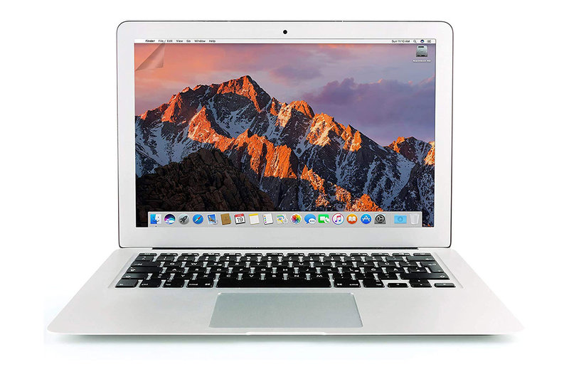
Design & build quality
The MacBook Pros are thinner and lighter than the previous generation: the 13- and 15-inch models are 14.9mm and 15.5mm thick (or ‘thin’, as Apple irritatingly styles it in marketing materials) and 1.37kg and 1.83kg respectively. (Last year’s MBPs weighed 1.58kg and 2.04kg, and were both 18mm thick, so Apple has achieved reductions of 17 and 14 percent respectively in thickness, and 13 and 10 percent in terms of weight.)
Dimensions
- 30.41cm x 21.24cm x 1.49cm; 1.37kg (13-inch models)
- 34.93cm x 24.07cm x 1.55cm; 1.83kg (15-inch models)

Externally the design is similar to last year’s, albeit on a slimmer scale, but there are numerous physical changes under the lid. The most obvious, and the flagship feature that occupied much of the unveiling event, is a touchscreen bar above the keyboard that Apple calls the Touch Bar, which we discuss in the next section.
One more thing before we move on: as expected, Apple has removed the traditional USB ports on the MacBook Pro, and the MagSafe charging port, and replaced them all with USB-C/Thunderbolt ports: four of them on the Touch Bar models and two on the 13-inch model without a Touch Bar. And you get a 3.5mm headphone jack too: phew!
Read more: MacBook Pro 2016 not working: How to fix MacBook Pro hardware problems

Touch Bar
The 2016 MacBook Pro comes with a new feature called the Touch Bar: a long slender touchscreen that sits along the top of the keyboard in place of the old function keys. Depending on the application you’re currently running – and any customisation options you may have selected – it can display and enable a wide range of functions and controls.
In Safari, for example, it shows tab thumbnails, forward and back buttons and the like; in Mail it shows QuickType typing suggestions and an emoji button. (Mail also offers more general predictive suggestions, offering to move an email to a folder that it thinks is suitable, based seemingly on scanning the contents and/or sender of the message.)
The Touch Bar supports multitouch, and there are some applications (in areas such as DJing) where you’ll be swiping and tapping with two fingertips at once. And we’ve found it admirably fast and responsive, switching near-instantly when changing apps or changing function within an app. Losing the function keys may occasionally be annoying – we must confess to still not having found a replacement shortcut for the handy old Cmd + F3 to temporarily clear the screen of all open windows – but its wide and customisable range of functionality should make for this. Read about what you can do with the Touch Bar here.

Touch ID
The one aspect of the Touch Bar that’s had most effect on our day-to-day MacBooking so far has been the little Touch ID sensor on the righthand edge. Not for Apple Pay, which we still rarely use even on iPhone – although yes, this feature means you can make Apple Pay payments online, on your Mac, without having to use a linked iPhone – but for unlocking the device.
Open the lid and as soon as the screen lights up, the Touch Bar does too, with a rather endearing bouncing arrow pointing to the fingerprint sensor and an instruction: ‘Unlock with Touch ID’. Place your fingertip on the sensor for the merest fraction of a second and the MacBook will unlock: there’s a tiny delay (of perhaps two seconds), but you don’t need to have your finger on the scanner for anything more than the very beginning of this period.
In terms of speed and reliability, we’re definitely in the realms of the second-gen Touch ID on the iPhone 6s and later, rather than the creakier first-gen Touch ID used in the iPhone 6 and earlier.
(Bear in mind, however, that as with the Touch ID feature on iPhones and iPads, there will be times when you will have to enter your password – after logging out of your account, for instance. And when you try to make certain changes in System Preferences.)
Fingerprint login is very convenient. But it becomes more convenient still when you factor in multiple user accounts. If you’re on the login window and multiple accounts are logged in, touching your finger to the scanner will automatically select and unlock your account and ignore the others, reducing what would ordinarily be a multi-step job into literally a single tap.
Furthermore, if you place your finger on the scanner and the account it’s connected to isn’t currently logged in and requires a password to unlock, the Touch ID scanner does at least recognise who is trying to log in and jumps to the appropriate password entry field.
Of course, if you’ve got an Apple Watch then you can unlock any Mac with macOS Sierra even more easily than this, thanks to the new proximity unlock feature. But not everyone has an Apple Watch.

QuickType
Perhaps the second most significant Touch Bar feature for the average user is going to be QuickType. In essence, and across a wide range of features including Mail, Messages, Notes, Pages and TextEdit, the Touch Bar brings the predictive typing suggestions from the iPhone and iPad and dumps them just above the keyboard of the Mac.
That might sound like a sensible place for them, given that it’s right next to your busily typing fingers, but it’s actually not. Not at all.

QuickType is supposed to be all about saving time. When you start pecking out an octosyllabic word on an iPhone SE’s little portrait keyboard, and QuickType cleverly works out what you’re going for and gives you a shortcut to complete it and sticks that shortcut right in your eye line, that’s handy and a time saver. But when the same thing happens on a MacBook, which has a full-size (if imperfect) keyboard and places the suggestions well below your eye line, it’s saving you quite a bit less time.
And while colleagues have noted that when typing at a good lick, the QuickType suggestions lag behind their fingers and they have to consciously slow down, we’ve never found that a problem – because we’re already having to slow down in order to look down at the Touch Bar. Sound touch-typing practice stipulates that you look at the screen and not at your fingers. But the QuickType element on the Touch Bar encourages and requires precisely the opposite.
Then again, few people nowadays have perfect typing form, and most of us will find our own best way of working with Touch Bar QuickType after a little practice: that may just mean waiting for the very biggest words and saving yourself the trouble then. And we do like watching colourful emoji appearing and disappearing while we type.
Oh, and one thing we do love about the Touch Bar when typing out documents: formatting. Having Notes’ basic formatting palette at our fingertips is a small but crucial convenience – write a subhead, tap the B and it’s bolded up. Features like this are all about finding the little things that work for you, and there’s already deep enough support that you’re bound to find a few.

Other features
Which naturally leads to my final thought, which is that nobody knows yet how successful the Touch Bar will be, because the software developer community has barely started to wrestle with its possibilities. Half the stuff it will be able to do by next summer hasn’t been thought up yet.
The Touch Bar reminds us a little of the 3D Touch screen tech introduced with the iPhone 6s (and, to a lesser extent, the similar but slightly older Force Touch tech in this very MacBook). For one thing, it has the potential to go one of two ways: it could remain a gimmick, or it could ‘shift the paradigm’ as people say about these things. It’s far too early to say which.
At launch the Touch Bar is an undeniable ‘ooh’ moment, a cool, flashy and original touch that draws the eye. But how useful will it really prove to be? We’ll have to wait and see.
To learn more about the Touch Bar’s functions, including how to customise the way it looks and behaves, read: How to use Touch Bar on the new MacBook Pro.
Keyboard and trackpad
Let’s talk next about the more traditional input elements: the keyboard and trackpad.
Trackpad
The trackpad first, because only the Touch Bar can outshine it as the MacBook Pro’s crowning glory. This is a truly vast trackpad: the one on the 15-inch model measures an astonishing 159mm by 99mm. Apple says these new trackpads are up to twice the size of the ones on the previous generation, and the extra space really counts. It’s easy to swipe clear across the screen with one trackpad gesture, without having to increase the sensitivity to such a point that it’s impossible to be accurate.

Desktop Luddites that we are, we continue to maintain that trackpads are an inferior choice to a decent mouse (your reviewer’s office 2015 MacBook Pro has a USB mouse attached), but the glorious trackpad in the 15in MacBook Pro is almost enough to make us doubt that.
It’s a Force Touch trackpad too, of course: once Apple commits to a new tech it really commits to it, and you can expect all new MacBooks for the next few years to boast Force Touch compatibility. For the uninitiated, Force Touch is different to traditional trackpad tech in both mechanism (when you click the trackpad it doesn’t actually move, instead simulating the feel of a click, more convincingly than the solid-state Home button on the iPhone 7 and iPhone 7 Plus, with a small haptic buzz) and function (it’s sensitive to two different degrees of touch pressure, which means you can either click things normally, or force-click them to invoke secondary controls that vary from application to application).
Like the 12-inch MacBook models released last year and this year, and last year’s MacBook Pro, these laptops get Apple’s Force Touch trackpad, which is sensitive to varying degrees of touch pressure and uses harder presses to activate ancillary functions depending on the application. You can do a Force-click on a word in Safari to pull up a dictionary definition, for instance.

The lack of physical movement should in theory make the trackpad less prone to part failure (a little like more reliable flash rather than moving-disc storage), albeit at the expense of a tiny output of battery power making those little buzzes. More importantly, the fact that this is simulated means it’s easier to customise – you can go into the System Prefs any time you like and fine-tune the magnitude of that ‘click’ effect.
And more important still, the addition of force-clicks holds the potential to greatly expand the MacBook’s controls – a development as big in its way as the right-click. (And one that the Mac gets first, for a change!) There are some nice little tricks and shortcuts at the moment (force-click to look up a word’s definition, fast-scrub a video timeline, and so on), and the longer the tech is out there, and the larger the user base of people with laptops that feature it, the more app makers are going to come up with clever Force Touch controls.
For more on the Force Touch trackpad, see 13 ways to use Force Touch on the new MacBook and Inside Apple’s Force Touch trackpad technology.
Keyboard
All of which is the good news.
The down side is that some compromises have been made in order to incorporate this large and beautiful trackpad; principally in terms of the keys, which have been shunted up to make room. For most keys the difference isn’t too noticeable. But the arrow keys in particular are squeezed into a skinny little rectangle of space. To be frank, we’ve found them almost unusable, having grown used to the space around those keys on the 2015 MBP. The arrow up and arrow down keys are now virtually interchangeable – whichever one we aim for, there seems to be a 50/50 chance we’ll get the other.

The keys are lower to the bed of the keyboard than on last year’s MBP, with a shallower typing action. To aid in the quest for slimness, and like the 12-inch MacBook, the new MacBook Pro features a low-travel keyboard using one of Apple’s ‘butterfly’ key mechanism designs. In this case it’s a second-gen design intended to provide a better feel, but we found it harder for our fingers to find the right keys when touch-typing and preferred the bouncier mechanism of Apple’s old laptop keys.
We experienced a slight loss of typing speed and accuracy, then (most pronounced at first, as is generally the case with these things – you largely get used to the tighter layout). But this is somewhat offset by the QuickType text predictions that you get thanks to the Touch Bar, and the more pervasive auto-corrections that arrived with macOS Sierra.
Other reviewers have observed a lag between even average-speed typing and the predictions appearing/updating on the Touch Bar, and this is fair comment; it is on the slow side. But for the auto-correct element of this equation speed is less of an issue. Indeed, we find it oddly satisfying when we mistype a word in Notes, for example, then see the red underline appear a couple of words later and the auto-correct kick in a couple of words after that, like the OS is dutifully working its way through your errors while you carry on.

The keys also feel slightly rattly under the finger, presumably as a result of the new shallow-action butterfly key-press mechanism used to make the laptop thinner than its predecessors, and they’re noisier than we’d like to boot. Mostly that doesn’t matter, of course; but you might be surprised how often you find yourself typing next to your spouse on the sofa while they try to catch what’s just been said on The Affair.
Read next: New MacBook Pro 2016 vs new Surface Book 2 with Performance Base
Speed testing & benchmarks
We tested the new MacBook Pro – the max-specced 15-inch model, with 2.9GHz i7 processor and 16GB of RAM – using the GeekBench 4.0.3 benchmarking suite. This model of the MBP recorded overall speed scores of 4,232 in single core and 13,211 in multi-core. Those are hot numbers by anyone’s standards – but are they hot enough?
For a very rough comparison, we looked at GeekBench 4 scores for the nearest equivalent from last year’s generation of Pros, the 2.8GHz 15-inch model, also with 16GB of RAM.
This test produced scores of 4060 and 12033 respectively for the 2015 model; but this one produced 4415 and 14627 – the older model actually beating this year’s upstart. (GeekBench scores are publicly available. Click here to search through scores for last year’s 15-inch Pros.) On the whole public scores suggest a small speed boost this year.
But for a more scientific analysis we turn to the systematic tests run by our colleagues at Macworld US, who put three models of the early- and mid-2015 MacBook Pros and three 2016 models through GeekBench 4.0.1. They found an undeniable upward trend but for general processing it was small: between 1 and 5 percent in the single-core tests, although the multi-core scores were a little less predictable.
Single-core processing speed scores (GeekBench 4.0.1)

- 15-inch MacBook Pro with Touch Bar (late 2016, 2.6GHz): 4,216
- 13-inch MacBook Pro with Touch Bar (late 2016, 2.9GHz): 3,927
- 13-inch MacBook Pro with function keys (late 2016, 2.0GHz): 3,765
- 15-inch MacBook Pro (mid-2015, 2.5GHz): 4,151
- 13-inch MacBook Pro (early 2015, 2.5GHz): 3,724
- 13-inch MacBook Air (early 2015, 1.6GHz): 3,219
Multi-core processing speed scores (GeekBench 4.0.1)

- 15-inch MacBook Pro with Touch Bar (late 2016, 2.6GHz): 12,842
- 13-inch MacBook Pro with Touch Bar (late 2016, 2.9GHz): 7,599
- 13-inch MacBook Pro with function keys (late 2016, 2.0GHz): 7,316
- 15-inch MacBook Pro (mid-2015, 2.5GHz): 13,564
- 13-inch MacBook Pro (early 2015, 2.5GHz): 7,022
- 13-inch MacBook Air (early 2015, 1.6GHz): 5,719

Graphics speed testing
Macworld US also tested the new MacBook Pro models’ graphics capabilities with the Geekbench OpenCL and Cinebench OpenGL benchmarks.
In Geekbench, the new 13-inch MacBook Pro with Touch Bar (equipped with Intel Iris Graphics 550) scored 30,826, which is 59 percent better than the last generation and 8.6 percent better than this year’s 13-inch MacBook Pro with function keys (with Intel Graphics 540).
The new 15-inch MacBook Pro with Touch Bar (with AMD Radeon Pro 450 graphics and 2GB of dedicated graphics memory) scored 42,827, up 38.7 percent on last year.

Geekbench 4.0.1, OpenCL benchmark. Longer bars are better. Top three are this year’s Macs; bottom three are last year’s
In Cinebench, the 13-inch MacBook Pro recorded 36.8 frames per second (fps), up 27.5 percent on last year’s entry-level 13-inch MBP, while the 15-inch MacBook Pro 2016 scored a stunning 70.4fps – that’s an increase of 13.7 percent on the 2015 model.

Cinebench R15, OpenGL test. Longer bars are better. Top three are this year’s Macs; bottom three are last year’s
Tech specs
Let’s look at those tech specs in a bit more depth.
13-inch MacBook Pro model (without Touch Bar)
- 2.0GHz dual-core Intel Core i5, Turbo Boost up to 3.1GHz, with 4MB shared L3 cache (Configurable to 2.4GHz dual-core Intel Core i7, Turbo Boost up to 3.4GHz, with 4MB shared L3 cache)
- 8GB of 1866MHz LPDDR3 onboard RAM (Configurable to 16GB)
- Intel Iris Graphics 540
- 256GB PCIe-based onboard SSD (Configurable to 512GB or 1TB SSD)
- 13.3-inch LED-backlit display with IPS technology; 2560×1600 native resolution at 227 pixels per inch; 500 nits brightness; Wide colour (P3)
- Built-in 54.5-watt-hour lithium-polymer battery; estimated battery life up to 10 hours wireless web use
- 802.11ac WiFi; IEEE 802.11a/b/g/n compatible; Bluetooth 4.2
- Full-size backlit keyboard with 78 (US) or 79 (ISO) keys including 12 function keys and 4 arrow keys; Force Touch trackpad
- 2 x Thunderbolt 3/USB-C ports; 3.5mm headphone port
- 720p FaceTime HD camera
- 30.41cm x 21.24cm x 1.49cm; 1.37kg
13-inch MacBook Pro model (with Touch Bar)
- 2.9GHz dual-core Intel Core i5, Turbo Boost up to 3.3GHz, with 4MB shared L3 cache (Configurable to 3.1GHz dual-core Intel Core i5, Turbo Boost up to 3.5GHz, with 4MB shared L3 cache; or 3.3GHz dual-core Intel Core i7, Turbo Boost up to 3.6GHz, with 4MB shared L3 cache)
- 8GB of 2133MHz LPDDR3 onboard RAM (Configurable to 16GB)
- Intel Iris Graphics 550
- 256GB PCIe-based onboard SSD, or 512GB PCIe-based onboard SSD (Configurable to 1TB SSD)
- 13.3-inch LED-backlit display with IPS technology; 2560 x 1600 native resolution at 227 pixels per inch; 500 nits brightness; Wide colour (P3)
- Built-in 49.2-watt-hour lithium-polymer battery; estimated battery life up to 10 hours wireless web use
- 802.11ac WiFi; IEEE 802.11a/b/g/n compatible; Bluetooth 4.2
- Full-size backlit keyboard with 64 (US) or 65 (ISO) keys including 4 arrow keys; Touch Bar with integrated Touch ID sensor; Force Touch trackpad
- 4 x Thunderbolt 3/USB-C ports; 3.5mm headphone port
- 720p FaceTime HD camera
- 30.41cm x 21.24cm x 1.49cm; 1.37kg
15-inch MacBook Pro model (with Touch Bar)
- 2.6GHz quad-core Intel Core i7, Turbo Boost up to 3.5GHz, with 6MB shared L3 cache, or 2.7GHz quad-core Intel Core i7, Turbo Boost up to 3.6GHz, with 8MB shared L3 cache (Configurable to 2.9GHz quad-core Intel Core i7, Turbo Boost up to 3.8GHz, with 8MB shared L3 cache)
- 16GB of 2133MHz LPDDR3 onboard RAM
- Radeon Pro 450 with 2GB of GDDR5 memory and automatic graphics switching, or Radeon Pro 455 with 2GB of GDDR5 memory and automatic graphics switching (Configurable to Radeon Pro 460 with 4GB of GDDR5 memory and automatic graphics switching); Intel HD Graphics 530
- 256GB PCIe-based onboard SSD, or 512GB PCIe-based onboard SSD (Configurable to 1TB or 2TB SSD)
- 15.4-inch (diagonal) LED-backlit display with IPS technology; 2880 x 1800 native resolution at 220 pixels per inch; 500 nits brightness; Wide colour (P3)
- Built-in 76.0-watt-hour lithium-polymer battery; estimated battery life up to 10 hours wireless web use
- 802.11ac WiFi; IEEE 802.11a/b/g/n compatible; Bluetooth 4.2
- Full-size backlit keyboard with 64 (US) or 65 (ISO) keys including 4 arrow keys; Touch Bar with integrated Touch ID sensor; Force Touch trackpad
- 4 x Thunderbolt 3/USB-C ports; 3.5mm headphone port
- 720p FaceTime HD camera
- 34.93cm x 24.07cm x 1.55cm; 1.83kg
UK price
The 2016 MacBook Pro models are no longer available direct from Apple (brand-new, at any rate: there are some on the refurbished store at time of writing) because they’ve been replaced by the 2017 Kaby Lake models. But for the sake of comparisons, here’s what the 2016 models cost at launch:
- 13-inch model (without Touch Bar): Starts at £1,449
- 13-inch model (with Touch Bar): Starts at £1,749 (256GB) or £1,949 (512GB)
- 15-inch model (with Touch Bar): Starts at £2,349 (2.6GHz, 256GB) or £2,699 (2.7GHz, 512GB)
Remember that these were just the base prices; if you configured higher specs than the standard, you paid more. You can buy all of the current models of the MacBook Pro direct from Apple here: MacBook Pro on Apple Store. You can also buy MacBook Pro from John Lewis. For our pick of the best deals out there, see Best MacBook Pro deals UK.
Apple issued its usual statement about international prices being affected by “currency exchange rates, local import laws, business practices, taxes, and the cost of doing business”, and although it didn’t mention Brexit by name that appears to be the cause of these prices. But it should be said that while potentially Brexit-related price rises are becoming more and more common in the tech sector, no other tech company has cranked up the prices post-Brexit quite as brutally as this.
We’ve teamed up with KRCS to offer 7% off any MacBook Pro or MacBook Pro Touch Bar until 16 April using the code MACWORLDMARCH7. That means you could save as much as £277 off a fully kitted out 15in MacBook Pro with Touch Bar, or £87 off the more reasonable 13in base model – but you can check out the full range of MacBook Pro or MacBook Pro Touch Bar models over at KRCS, making this the cheapest way to buy any new MacBook Pro right now.

Colour options
The MacBook Pro 2016 came in two colour finishes: silver and Space Grey. It looks pretty great in Space Grey, we reckon.
